Insights
Realising our positioning through kinetic identity – A new look for TheTin
4 minute read
29 October 2019
In early 2019, TheTin went through a process of repositioning. In a bustling market of digital agencies, we needed to find a unique and defensible territory to set us apart from our competitors and to communicate our value to our clients.
While the work we do has continued to evolve, and the technologies we help our clients utilise has advanced, our own visual identity had remained the same for a number of years, resulting in a disconnect between our identity and our new positioning.
Redefining brand principles
First we needed to revisit and define our brand principles. What do we stand for, both as a brand and as a partner to our clients? What are the rules that underpin everything we do?
- We are a fun and friendly bunch, but we take our work seriously, building meaningful relationships with our clients.
- We are dedicated to our craft, constantly exploring and experimenting. We strive for innovation, originality, meaning and impact in everything we do.
- Our approach is dynamic, flexible and evolves as new technology and client needs emerge. We never stand still.
- Our expertise span a wide range of disciplines, allowing us to create relevant stories and build modern tools for our clients – big and small.
- People are at the heart of everything we do. Our work is approachable, accessible and user-centric.
From defining our brand principles, this informed the traits of our brand personality. What we wanted to express through our visual identity and communications.
- Playful but serious
- Bright and friendly
- Curious and surprising
- Purposeful and delightful
- Digital and dynamic
- Empathetic and approachable
- Reliable and reassuring
Chat to us about how we could help you improve your brand narrative with a strong digital presence.
Book a brand consultationHow should our personality define our visual identity?
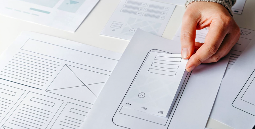
To begin to answer this question we first conducted an analysis of our visual identity. Assessing every element and identifying the flaws in our visual language. We also looked at our competitors. What they were doing well and what they were doing poorly – we don’t want to blend in with the crowd.
There was a lot to talk about, but some common themes emerged.
Bright and bold
We had talked a lot about being ‘bright and bold’, but the way we put this into practice in terms of colour and typography was very literal. This hindered the flexibility of our visual language and was often overbearing when the focus should be on our work and content first and foremost.
Digital-first
We maintained a digital-first ethos, but our logo was hand rendered. Designed to represent the birth of an idea, or a moment of inspiration, our logo was certainly different to those of our competitors, but it was not flexible enough and contradicted our new positioning.
Motion
Increasingly part of our service offering, motion in our identity (or the lack of) was another key observation. With ‘kinetic identity’ now the standard in how brands are recognised, we knew that motion needed to be identified early, not as an afterthought.
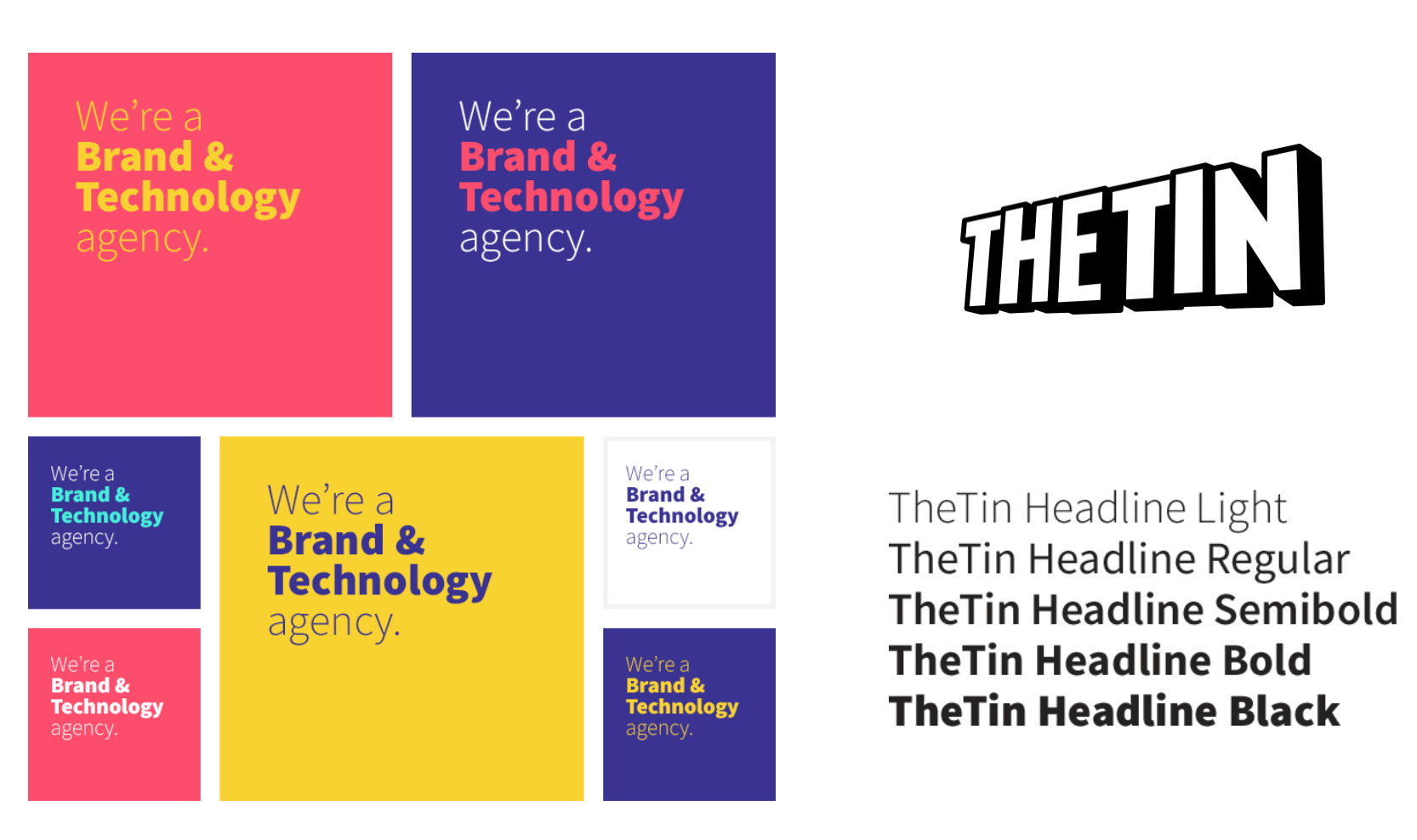
Overview of new colour palette
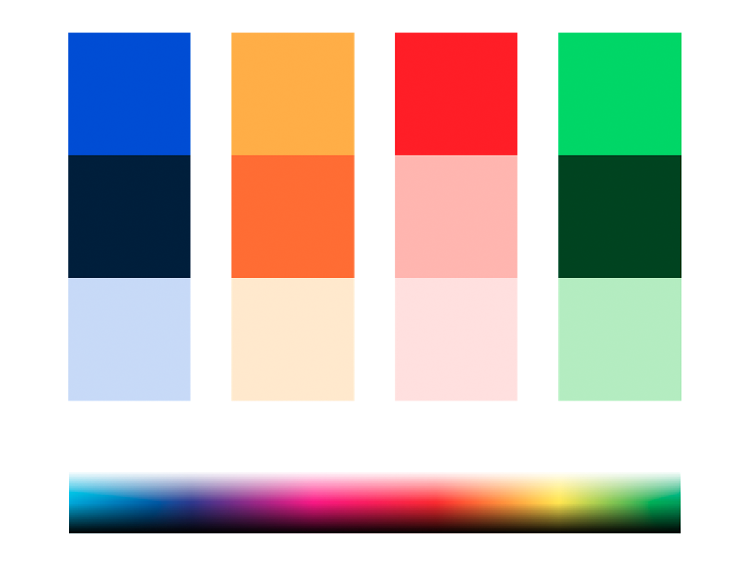
Overview of new colour palette
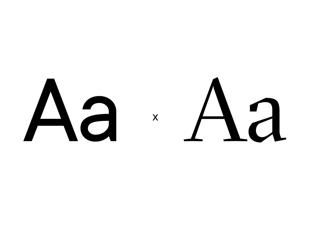
Typography
Our new approach to typography is playful but serious, digital and dynamic. Pairing a modern sans-serif typeface, together with an elegant and refined serif. Allowing for great flexibility in how we communicate. We tailor our application to our messaging. We can be geometric, or sculpted. Rounded, or angular. Cheerful, or sincere.
Colour Palette
An expanded, and highly flexible colour palette. Underpinned by four vibrant primary colours, complimented by a versatile set of secondary colours and backed up by an understated set of tertiary colours.
We have also notably included an approach to the use of an ‘adaptive palette’, refering to instances where we take a content led approach to colour.
Kinetic Identity
Our visual language is underpinned by our kinetic identity. We use generative motion loops to give a look under the hood at the work we do within the complex digital world. Taking two colours, geometric forms and fundamentally simple motion principles, we duplicate, tile and offset timings to produce infinite looping patterns.
Our patterns always appear infinite. Orchestrated with a clear sense of interconnection and flow. Representative of the digital landscape and the journey on which we take our clients through it.
We have three core approaches to the application of our patterns: tearing, panels and fluid.
We use tearing as the window that reveals our inner workings, in use cases where expressing our personality is a priority.
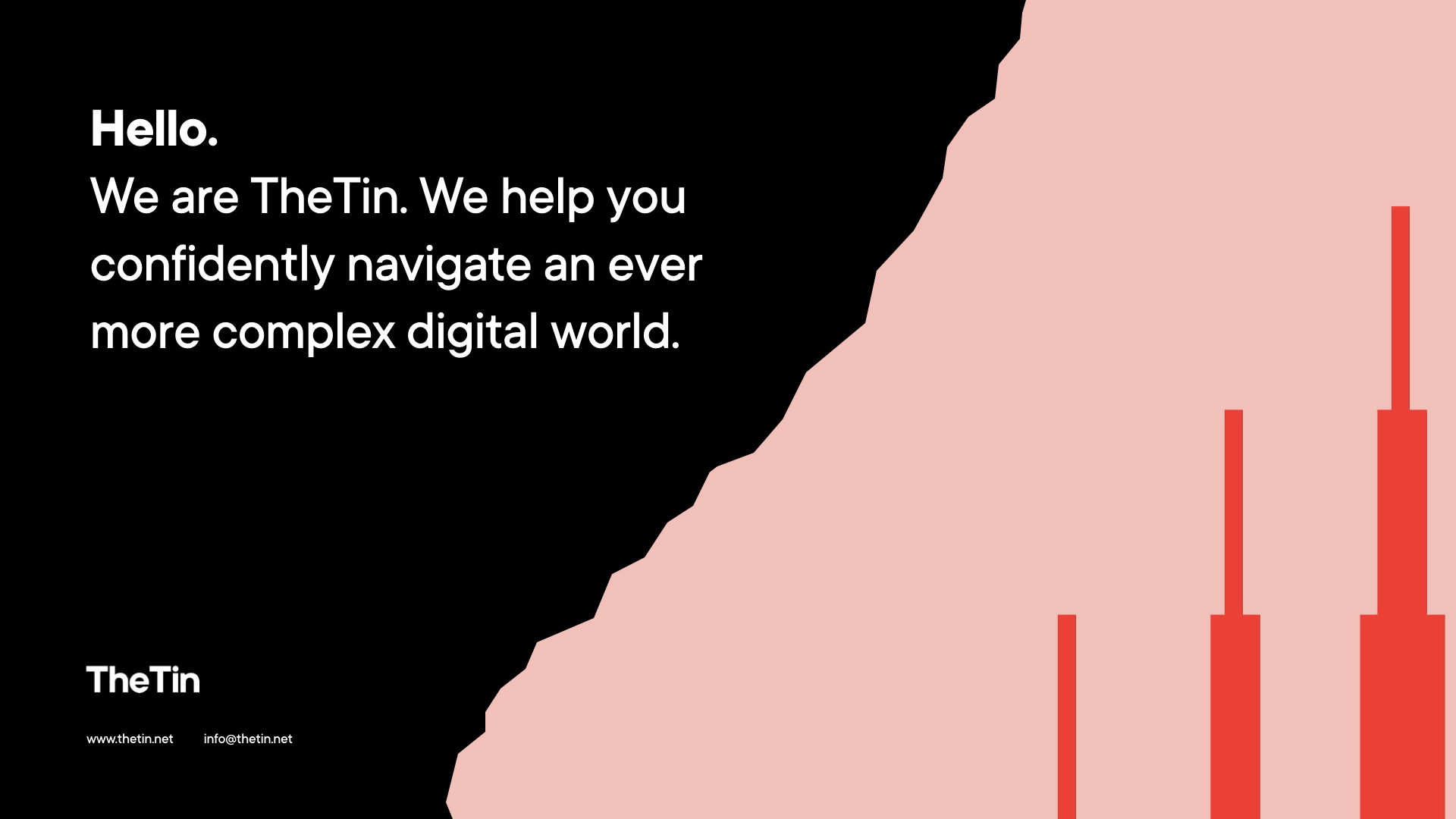
Tearing application example.
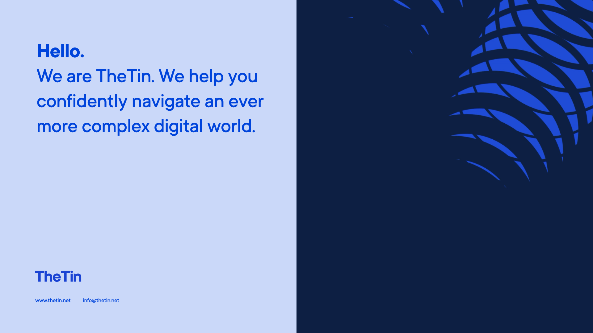
Panelled application example.
Panels are used for more conventional layouts, where tearing may be less relevant. Or in use cases where we may want to be less colourful and a little more serious, we extract the geometric forms and work them into compositions without any visible container.
Logo
So, how did we embody our entire personality in a single mark? Well, we didn’t need to. With such a flexible, adaptable and robust visual language behind it, our logo simply had to be scalable, and unobtrusive enough to keep the focus always on our work and our content first and foremost.