Insights
Design wipe: 2020 trends
5 minute read
31 January 2020
“New year, new design trends. We’re cutting through the noise this year and aren’t going to dwell on standard subjects like layout or ‘Colour of the Year’, but focussing on the bigger picture instead.”
Calling it now, the 2020s will be the decade of the user. First and foremost, brands should be focusing on designing genuinely useful experiences, then fixating on the pixel pushing later.
1. Delightful data
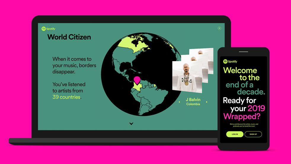
Artificial Intelligence has jumped leaps and bounds in recent years, and more brands are getting more creative about how they show us that data. ‘Spotify Wrapped’ and ‘Playstation Wrap-Up’ have done a decent job to provide tailored data that users actually care about.
I don’t care about how much money people plunged into Fortnite last year. What I really want to know is how many hours I spent in Red Dead Redemption 2, trying to hunt that legendary cougar, then feeling a sense of shame and realisation that I probably spend way too much time playing video games.
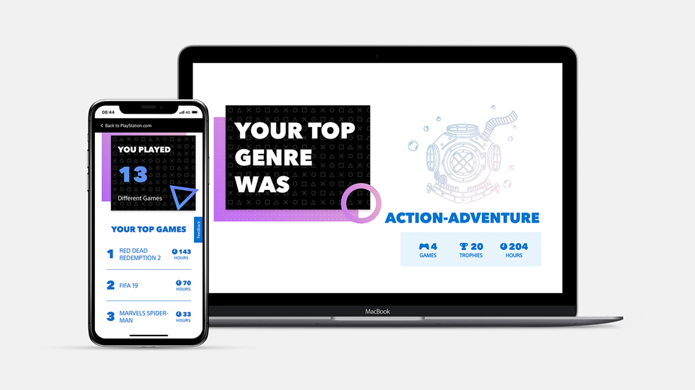
And it’s not just about the kind of data that’s shown to us - it’s important to consider how it’s presented. Spotify went big on interactivity this year, with smooth scrolling animations and perspective changes when you move the mouse on desktop. Whereas mobile is an entirely different experience. In-app, users can share their statistics straight to their social media accounts, and the next statistic is only a tap away and revealed like an Instagram Story.
Using Spotify’s API, we created a VR interface to allow users to explore music more immersively.
2. Accessibility first. Make it pretty later.
‘Accessibility’ simply means to make your products usable by everyone. More brands are realising that they have more than one audience type, so they need to cater for everyone. Aspects such as good colour contrast, legible typography, photography alt text for users with screen readers all need to be considered and well thought out for a design to be accessible.
Dark Mode has been a big topic in recent years and Apple finally joined the bandwagon with iOS 13 in 2019. Not only is it a great way to keep scrolling through Twitter before bed without your other half complaining about the light, but it’s also been said to reduce eye strain.
It’s typically applied to video game UIs and TV/film apps as it puts focus on the content rather than the surrounding interface elements.
Although, if it’s not done right, Dark Mode often comes with readability and contrast issues. Newspapers and magazines traditionally use dark ink on light paper, so there’s a sense of unfamiliarity, or even discomfort, when reading large amounts of white text on a screen.
Once upon a time, subtitles were purely reserved for the hard of hearing. Gone are the days of having to plug your headphones in every time to watch a video in public. Now, when you’re scrolling through Facebook, videos are muted until you tap on them and often include subtitles so you can keep watching without interrupting anyone (although, there’s always that one person that insists on playing videos through their tinny speakers in the train’s quiet coach!).
3. Good UX at the forefront of self-serve
We’re living in an on-demand society where we want things as quickly as possible. Nothing is more frustrating when buttons are not where you’d expect them, or there is little filtering functionality, or the hierarchy is all wrong. Brands are now more aware of having a good user experience in e-commerce and making purchases at self-serve kiosks.
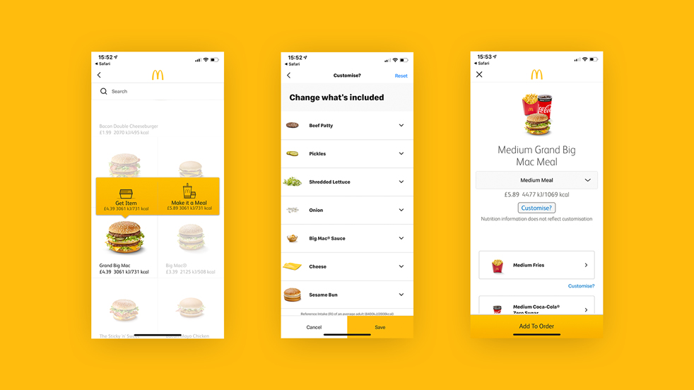
McDonald’s self-order kiosks makes customisation easy to see all of the options, without holding up the queue behind you or struggling to read the tiny writing on the menus behind the tills. It puts the customer in control of what’s going in their order.
Could we be seeing AI introduced in these machines in the future? The machine should learn that it doesn’t need to ask if I want a large meal, because of course the answer will always be ‘yes’.
“It’s not about how the user works around the experience, but more how the experience works for the user’s needs.”
4. Animated text
Content is key, and brands are relying less on photography to tell a story. However, you still need to grab your reader’s attention in the first place. Animating text is a great way to inject some personality into your brand if you don’t necessarily want to fall back on graphic devices.
At the end of the ‘10s we saw a surge in custom fonts, so it’s no wonder brands pushing the limits on typography and are opting for chunky, animated text to head their campaigns.
Apple is known for their somewhat clinical design, but these days they can be seen using fast-paced video editing, with snappy, yet subtle, text transitions to cram as much content in as possible -- although, is this just a new method to distract us from the hairdryer-inspired earphones?
5. ‘Nu-skeu’
Skeuomorphism is a term used to describe the style that mimics real-life objects. Thanks to Google’s ‘Material Design’, the flat design style can be seen virtually everywhere since the mid-2010s.
On the flip side, skeuomorphism is still the preferred style in VR, as shadows and realistic 3D elements are used to make the player feel more immersed in the environment.
Although, as mentioned before, we’re living in an on-demand society, and skeuomorphism styling takes considerably longer to design and develop.
I’m not suggesting that full-on skeuomorphism is making a comeback, but based on the revival of effects such as gradients, glows and drop shadows recently, might we be looking at a new flat design/skeuomorphism hybrid in the new decade?
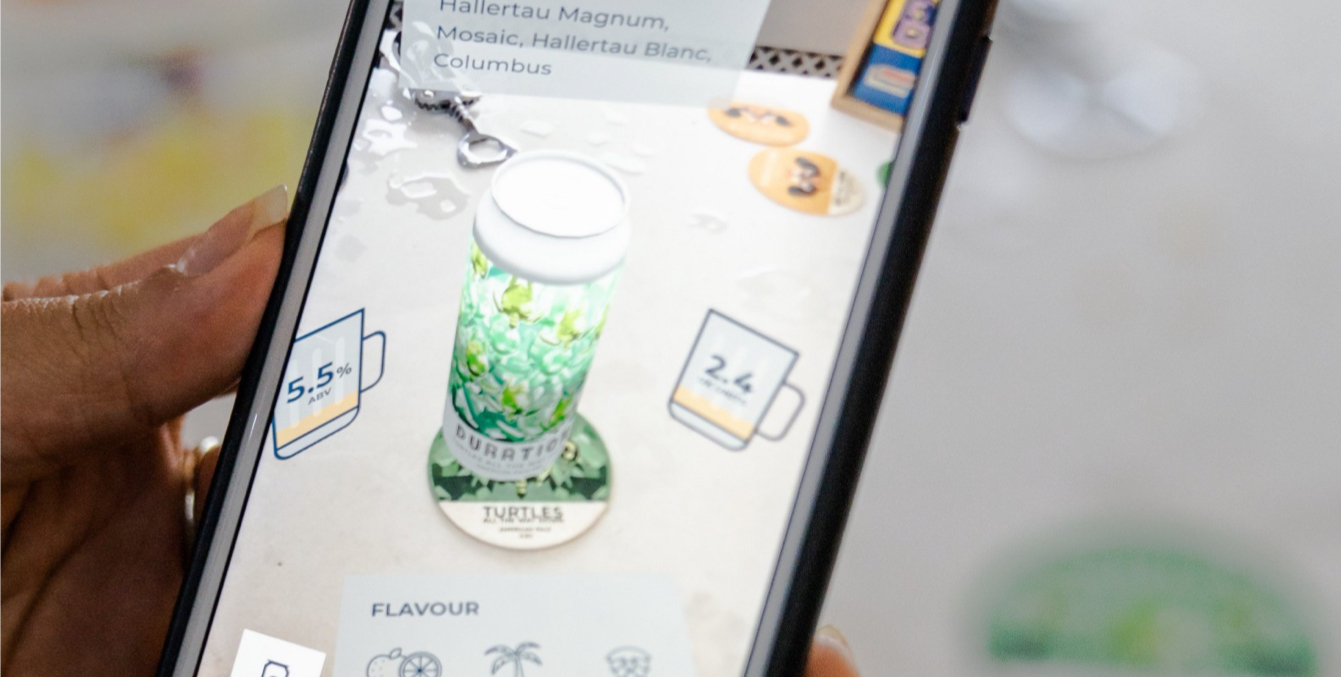
6. The realities are going mainstream
With Apple and Google introducing their Augmented Reality development tools, ‘ARKit’ and ‘ARCore’, in addition to Facebook’s Oculus Quest VR headset, AR and VR are quickly becoming less of a fad and instead more accessible. Designers also have more platforms to create with Adobe’s launch of Aero and Dimension last year.
We recently hosted an internal Tinnovation Day where a few of us experimented with Adobe’s AR tools, so sign up to our newsletter to stay in the loop for insights and updates.
To conclude…
The overarching prediction for 2020 is customisation. Both in terms of how users can customise their own experiences, but also how brands can ensure they stand out and show their personality.
Users like to be in control of how they browse sites and apps. Brands are finally realising that personalisation is key - it’s not about how the user works around the experience, but more how the experience works for the user’s needs.